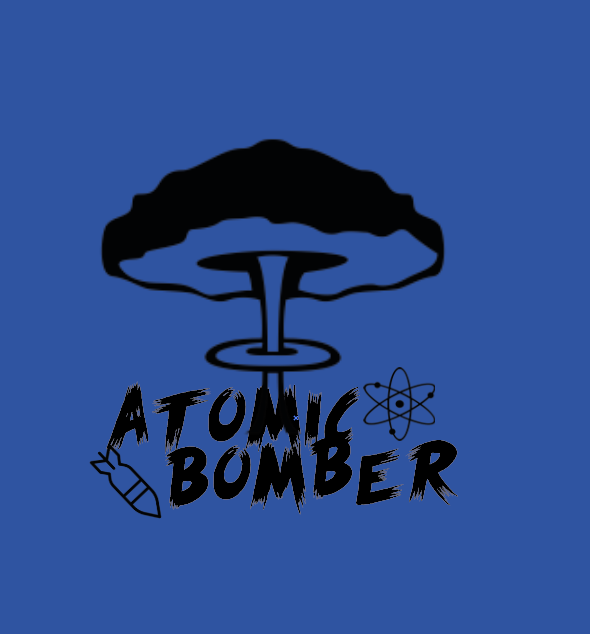
Atomic bomber design
before i started to create the logo i made a few sketches (not great quality) of how i wanted the logo to possibly look. Once i had chose one and was happy with it i went onto adobe illustrator to create it.
i wanted my design to be simple and keep the original blue from the old logo so it wasn’t completely different but still have a more modern look, and stand out a little more.
the text i chose made it look like it had been burned slightly by a bomb going off which i thought fitted really well. once i was happy with the text i made it the size i wanted and moved on to adding some pictures to my logo. Since i was using the word atomic i got a picture of an atom and them a bomb for the word bomber, since i wanted to keep it simple. i then got some black and white clouds from a explosion to sit behind the words to add a little more detail etc.
